
Although sometimes a little too loudly. A development in professional is the creation of the third or alternate jersey. Most of the time, the alternate jersey is a refreshing option. Whether it’s a playful take on the team’s traditional color scheme, celebrating the team’s history with a throwback option, or creating a retro/vintage look to commemorate those glory days of yesteryear, the alternate jersey invites the die-hard fan to have a little fun with their favorite team and injects a little joie de vivre in the pressure-filled world of sports. Unfortunately, these alternates can go horribly wrong. These third-option monstrosities make up some of the worst marketing decisions in sports. Almost as bad as the decision to green-light Joey for NBC. Because that worked out well for everyone.
So without any further ado, Four Guys brings you their picks for the best and worst of alternate jerseys from the four major sports leagues.
Scott's Picks
The Best of the NFL: "The Creamsicle"

These alternate jerseys out of Tampa Bay are the coolest use of tangerine since Led Zeppelin's titular track off Led Zeppelin III. The use of bright colors on top with the white pants are perfect for a team from the sunny state of Florida. Tack on that sweet logo of a swashbuckling pirate (pre-cursor to Captain Morgan, maybe?) and this uniform option does everything right, with just a little bit of wrong. Move over Captain Jack Sparrow, here comes Captain Josh, er, Freeman!
The Worst of the NFL: "The Bumblebee"

This third option for the Pittsburgh Steelers does everything wrong. Perhaps they were going for a "swarm of killer bees" look. Perhaps the vision was that of a 1930s chain gang. Either way, these uni's are so hideous in person or on television that they induce headaches on site. Oh, maybe that was the idea...
This third option for the Pittsburgh Steelers does everything wrong. Perhaps they were going for a "swarm of killer bees" look. Perhaps the vision was that of a 1930s chain gang. Either way, these uni's are so hideous in person or on television that they induce headaches on site. Oh, maybe that was the idea...
The Best of the NBA: "The City"

The NBA has the dubious honor of having some of the best and worst jersey ideas ever. For this fan, "The City" uni out of Golden State was an excellent throwback to the 1960s San Francisco Warriors. Simple and elegant in design, the iconic Golden Gate Bridge silhouette encircled with the player's number and the lack of a specific locale inscribed above the logo reminds basketball fans that the sport has always had a grassroots feel growing out of local gyms, parks, and courts throughout the country, where sometimes the neighborhood you're from is much more important than the city or state.
The Worst of the NBA: "The Sleeve"

Yep, Golden State has the coolest and ugliest alternate jerseys out there. Those bright yellow shorts with the royal blue stripes are way too busy to look nice. They also seem like a blatant rip-off of the Hornets' "NOLA" jerseys, which were just as ugly. But let's move on to the most atrocious aspect of this uniform. Sleeves? Really? Sleeves in basketball should only be worn when a player is warming up or sitting on the bench. Why? Because we all secretly make fun of basketball players who wear shirts under their jersey. Just like any athlete who wears glasses. Both make them look just slightly less crazy and intimidating. Don't believe me? Picture Metta World Peace in both. Besides, sleeves take away from our favorite part of the NBA - the ridiculous tattoos. Putting sleeves on Birdman is like putting pants on female beach volleyball players. Just ain't right.
The Best of the NHL: "The Vintage Green"

Glorious. That's all that needs to be said about Minnesota's incredible third jersey design. These jerseys represent what we love about professional ice hockey – no flash, no complicated design patterns, just business. The forest green serves as a perfect backdrop to the beautiful script scrawling across the chest. Remember when we were kids playing on peewee/Pop Warner/Little League/CYO teams? Our uni's were nothing but one solid color with the team name or sponsor written in simple script straight across. As kids we wished those uniforms offered a little something more. Well, this Minnesota alternate is a throwback to those days. When the game was just a game, where fundamentals were praised and supported. A time when it was all about playing the game the right way and everyone shook hands at the end. This jersey is beautiful in design and sentiment.
The Worst of the NHL: "The Mets' Reject"

Okay, so I really wanted to choose the Islanders' Gordon's Fisherman eyesore. But Paul was quick to point out that they actually wore those as their primaries from '95/'96 to '96/'97, which made me laugh. So I figured I'd pick on the Islanders anyway and choose the putrid sweaters you see above. These jerseys are poor in concept and in design (and it's not because I'm a Rangers fan). First, black appears nowhere in the Islanders color scheme before these jerseys, so why throw it all over the place on this alternate uni? Which leads me to my next point. These jerseys look like the ugly cousin of the Mets' black road alternates, which even the Mets abandoned. For a team that's on the rise, this jersey brings them down. I don't even know why I'm complaining. The whole color scheme is going to change to plaid and black-rimmed visors when they become the Brooklyn Hipsters anyway.
The Best of MLB: "The Swingin' Yellow"
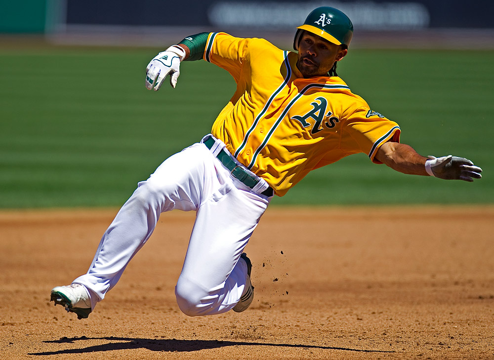
Indicative of a Billy Beane team, these home alternates are economical in their coolness. The Athletics decide to keep their traditional "A's" logo with a slight twist – putting it in green and sticking it right by the heart (where every player should keep his/her team's identity). The biggest change is that bright canary yellow jersey dominating Oakland's jersey. An absolute throwback to the 1970's Swingin' A's era which boasted players such as Reggie Jackson, Felipe Alou, Roberto Pena, Vida Blue, Catfish Hunter, and Rollie Fingers' mustache, this third jersey option reminds us that we should still take notice of that team out in Oakland.
The Worst of MLB: "The Camo"

Sigh. The San Diego Padres have built a very strong relationship with our nation's military and have thus dubbed themselves "The Team of the Military." In honor of those servicemen and servicewoman, the Padres don these uni's every Sunday home game in a misguided attempt to be patriotic. The brave men and women who serve in our nation's military where the camouflage because that is what they do and that is what their job calls for. The Padres are a group of baseball players who should wear their traditional uniforms because that is what they do and that is what their job calls for. And they have a pretty deep closet to choose from. So let's scrap this idea since it has missed its mark and have everyone wear their respective uniforms. Otherwise, I'm showing up to work in buckets, pads, and skates. And I don't think I'm allowed to drop the gloves with my boss.
Kevin's Picks
The Best of the NFL: "The Orange Crush"

A theme you will notice about my selections; I love bright
colors and perhaps no jersey was “brighter” than those of the Orange Crush Broncos. These bright orange beauties draw your eye and the electric blue is the
perfect compliment. The old Bronco logo acts as the icing on the cake. How can
you beat a horse jumping through a giant D? The answer is: you can’t.
The Worst of the NFL: "Fashion violators"

The Best of the NBA: "Lob City's Best"

Light blue will get you very far in my book (the Chargers powder blue uniforms almost won my favorite NFL alternate). Mix that blue with some striking red and some fancy lettering and you have these awesome Clippers jerseys. They also have the old-ABA look to them, which I love. Forget Doc Rivers; if I’m Chris Paul, these jerseys are the reason I’m sticking with the Clips.
The Worst of the NBA: "A Funeral in South Beach"


The Best of the NHL: "Fire on Ice"

The Worst of the NHL: "Business as usual"

The Best of MLB: "The lovable loser"


The Cubs have a long, tragic history of losing but they are
certainly winners when it comes to having great alternate jerseys. I personally think the Cubs should wear these jerseys most of the time to take away attention from their on-field productivity (says the Met fan). The classic
blue accentuated by the red “C” with the cute bear in the middle is really a
thing of beauty. The lesson, as always: cute bears always win (except in baseball apparently).
The Worst of MLB: "Nightmare in the Bay"

The one thing we have established is that I am a fan of
bright colors and enjoy when teams use orange in alternate jerseys, so I give
the Giants credit for trying. But, dear god, these are awful. They look like
Halloween decorations. The orange is a strange muted color and I don’t like the
font of the word Giants across the front. Nit-picky, I know, but these strike me
the wrong way. (I also hate Halloween, which could be why I don’t like these
uniforms. I don't like scary things and it takes attention away from my late-October birthday. I know everyone loves it and it's their favorite holiday or whatever. But I hate it. End rant.)
Dave's Picks
The Best of the NFL: "Pat the Patriot"

New England's bright red throwbacks are consistent with the All-American color scheme of their mainstays but give Tom Brady & co. a much bolder "pop." More importantly, Pat the Patriot will always be cooler than Flying Elvis by a country mile.
The Worst of the NFL: "The Navy Blue Bunt"

When it comes to alternate jerseys, it's better to swing for the fences and whiff than to bunt. With apologies for the cross-sport metaphor, the Titans are among the too-many teams that bunt. What makes these uninspiring uni's stand out, however, is their doubly uninspiring status as demoted pseudo-throwbacks. These navy-dominated jerseys were, for years, the Titans' standard issue at home alongside light blue alternates before they were swapped in '08. Bold move, Tennessee!
The Best of the NBA: "The Spur"

Just like the the team that wears them, you may think these uni's are boring, but I think they're slick. The Spurs debuted these alternates with the off-center number and secondary logo on a plain silver backdrop (even the waistband is silver) just this season. Some people complained that the streamlined design had the aesthetic of practice jerseys. I think the aesthetic mirrored the eventual Western Conference Champs' demeanor: cool, subtle, understated.
The Worst of the NBA: OKC's "Faux-Throwbacks"

I'm not opposed to the faux-throwback concept, in general. In fact, it's just silly enough to amuse the hell out of me. Though I may dislike the South Beach basketball culture as a whole, for example, I can't get enough of their ABA-inspired Dunkin' Donuts-y uni's. But the Thunder shouldn't be allowed to have a pretend past; their real past is much too sore an issue. These just aren't right – no matter how much I dig that vertical lettering.
The Best of the NHL: The "You-Can't-Go-Wrong-With-Penguins"

...And you really can't. Whether you're Morgan Freeman, Robin Williams, or a mid-90s ad exec pushing a truly nauseating beer, penguins are a fool-proof bird with which to work. It would be more notable if Crosby, Malkin and co.'s alternates weren't in contention for the NHL's best.
The Worst of the NHL: "Lakers on Ice"

Silver & black have served you well, L.A. Kings. They brought you street cred, the Great One, and the Cup. If you called a press conference tomorrow to announce that you'll never sport these embarrassing, purple & gold, Lakers-of-the-ice sweaters again, I'd be very much pleased. That would be a good day.
The Best of MLB: "Powder Blue in Missoura"

Yo, listen up! Here's a story about a little guy that lives in a blue world. And all day and all night and everything he sees is just blue – like him, inside and outside. Blue his house, with a blue little window and a blue corvette, and everything is blue for him, and himself, and everybody around, 'cause he ain't got... nobody... to listen to.
(Sometimes awesome is self-evident, and you might as well just quote hypnotizing, decade-old pop songs as try to describe it.)
The Worst of MLB: "Non-Existent in the Bronx"

Because in thinking they're too cool for alternate uniforms, the Yankees continue to suck.
Looks great so far guys, keep it up!
ReplyDelete